SPELLWRIGHT UK & Australia Cover Rethink
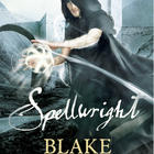
Just got word from my UK editor that they have been pondering their cover for SPELLWRIGHT and looking for a way to work the academy of Starhaven (a magical academy based loosely on a university in New Haven) onto the art. I hadn’t been aware that cover art might change, so don’t take this as final, but here’s a peek. What do you think?

Comments
8 Responses to “SPELLWRIGHT UK & Australia Cover Rethink”
Kei
2:40 pm Dec-11-2009
I like this better than the other one they had chosen for the UK version. This one seems more like the cover of a sci-fi/fantasy novel. The old one, by comparison, was more fitting for a who-dun-it mystery novel. In my ‘what the hell do I know anyway’ opinion.
blakecharlton
2:41 pm Dec-11-2009
well, given you’re a fantasy reader you know a whole lot! great to hear that you think it’s an improvement
Cara Powers
3:29 pm Dec-11-2009
This is completely ick. I don’t remember the first one they had, but seriously, this is one of the worst “man in cloak” covers I’ve seen. Compared to the US cover, the UK cover bites . . . hard.
blakecharlton
3:53 pm Dec-11-2009
well, given that you’re in America, i’m gonna look on the bright side and be glad that you like the US cover
Phil
3:48 pm Dec-11-2009
I don’t think the problem with that cover was the background, the problem is with the cloaked man… looks bad. I don’t mean that the cloaked man is a bad idea, only that the rendering is weird…
There’s room for improvement.
blakecharlton
3:57 pm Dec-11-2009
Hi Phil, thanks for stopping by and lending me your opinion. I do appreciate it. “The cloaked man covers” do seem to rub and lot of people the wrong way. Aidan just posted about it here: http://aidanmoher.com/blog/2009/12/cover-art/cover-art-spellwright-by-blake-charlton-uk-cover-take-two/
Sir Tessa
6:51 pm Dec-11-2009
I prefer it, especially since it draws attention away from the figure’s outline. There’s something in the angle or the posture that makes his head look disproportionately large on his body, which on the light background really stood out.
That and it’s just a gorgeous backdrop anyway.
blakecharlton
11:54 am Dec-13-2009
Yeah, now that you mention it the perspective is a bit…off. I do like the background too. Though some part of me was hoping they’d use an image of my old college, after which the setting is based